Wednesday, August 7, 2013

The Makings of Drop Cloth

Before really deciding the career I was going to go into, I was a Youth Specialist caring for the needs or redirecting the behavior of at risk teenage girls (what some circles call, throw away kids). I watched these girls try to cope with learning things we have all taken for granted. They were more concerned with matters that only adults should be thinking about and their development in the matters of a child were arrested. What went tilt after these children were born?

While thinking this, I was in my studio about to embark on another series. I looked at what I had done and wondered if I was really pleased with my work. I know when I initially started back with art about 5 years ago, I was so in love with the style of art nouveau. In studying those artists, I saw they neglected using women of color. It was upsetting. So I began drawing those women in that particular genre. What happened was I started thinking like a business woman and saw what was getting more responses then other pieces. I began concentrating on generating more income and looking at those artists that were more successful then myself. From what I gathered, it was illustrators and caricaturists that were getting the interest that I desired as well. Slowly my work began border lining on illustration. There wasn't anything the matter with illustration art, I liked it...but it wasn't what I know.

Isn't that what is taught with writers? Aren't writers suppose to write what they know. The subject matter is more rich and interesting to the reader. How much different is that lesson from what an artist should do? Isn't that how an artist really finds his/her niche? I then researched how to find the niche of an artist, as you have read in my other entries on this blog. I noticed that other artists did have a particular style they never deviated from. My work has a style but there was something missing....something I forgot about....its the thing I know that I know. I didn't incorporate what I chose as I career.

I have watched people for years. I have studied behavior and have wondered why an adult would do this or that. In so doing, I discovered another aspect of my style of art work.

In this series, called Drop Cloth, I thought about the artists from the 60's and early 70's. I never understood the splashing of paint from one side of the canvas to the other and then for the viewer to understand the artist's message in the work. It looked like a drop cloth a painter used when protecting the furniture or the floor. Enter a child excited about something that happened in school or seeing a caterpillar for the first time. Will the painter, artist, or busy parent for that matter, stop what he/she is doing to listen to the child go on and on about something as mundane as a caterpillar? Who is more important? What about the estranged parent on the phone to a child saying derogatory things about the other parent and using the child as a pawn? What about the parents arguing in front of the children not caring what damage words have on delicate ears? Its like slinging paint and not caring where it lands.

In the series, the children's faces are drawn in my favorite medium, black ink. The canvas is white Bristol. Each piece is cut 6 x 4 1/4 inches. I used only 2 different colors in the water color wash. The two colors represent having two people that created a child and needing two people to raise a child. Whether the parent is estranged or not, he/she has something to do with the development of that child. The parent may never be mentioned, it doesn't mean the child doesn't think about him/her. The eyes of each drawing never see the color wash. The reason for that is the same as the faces looking at the viewer. The innocence children lose is not always from outside sources. Children are like sponges. They absorb what is in front of them. If they are not protected, they will repeat the behavior. There use to be a time when a child's ears were covered from the use of profanity...now children repeat those words. Where did they learn such behavior?

The rest of the series can be viewed on my facebook page, Lenora's Ink.
Monday, June 3, 2013

Just Because

I call this piece "Just Because". The title came from when a man who I am use to asking to see my drawings made a comment. First let me preface, I had been drawing Caucasian women for the most part. It seemed as long as I did, most of the community would come by and be pleased with what they saw. In using a tonal pad or the first time, I found that it was easy accomplishing other skin tones. The response I received wasn't favorable.

I suppose I would have normally gone back to what I have been doing. The only problem with that, I liked what I am doing now and didn't wish to go back. I continued then no matter what the response. Why? Well, just because. Whether anyone likes it or not - I like it. And frankly, its about time!

I have been drawing in hopes that I could generate sales. Whether I liked it or not. If the people like it, sales would be abundant - right? Not so....not like I would have liked.

The sketch wasn't difficult and it seemed like everything was balanced. For some reason, I stopped inking before going on with the color. When I realized it, I stopped to take another look. How did the eye get to look like its looking different from the first?
 I was a little discouraged thinking that it would work itself out as I went along. The thought of tossing this one was something to fight. The tilt of the face was causing the rest of the face to go tilt as well and the balance was getting a little off. It then became to be a challenge. As long as anxiety didn't take over, there had to be a resolve.

I took another step back and was pleased with the final outcome. Every time I draw a woman of color, I can either see myself, someone in my family, or someone I met in my life time. It just seems so cool to me. I am still liking this tonal paper. I am hoping I will find other uses for it.
The final product is posted on my new account on RB. Cards and prints are available for sale. If interested in the original, please email me.

Thursday, May 23, 2013

Lilly

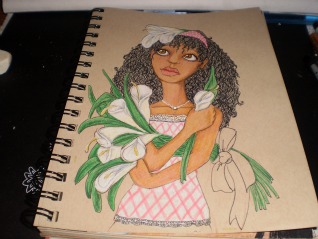
Lilly is actually the first one drawn in the sketch seen on the Daphne post. It took a moment to draw her as well as it did Madeline because I wouldn't stop drawing them covering up their bodies. I have no idea why. So I put clothes on the last two...still they had to have flowers. It was something I added because it isn't shown with women of color too much.


I saw them all of the time when studying art nouveau with Alphonse Mucha most often...the flowers that is. Definitely not women of color, which I have written about before.

Instead of placing Lilly in a field and being a city girl myself, I really like the texture and design of brick. Don't ask why. I noticed that I have done this several times before in other works of mine. What she is looking at, and it didn't come out too well in the scanning process is a humming bird.

I was talking to a co-worker that deliberately plants certain flowers for the humming birds to come to his garden. In Michigan? I have never seen them. He says after awhile they have got friendly with him and will buzz right to his hand... or rather humm. That was a little hard to believe but apparently on my mind when drawing this one.


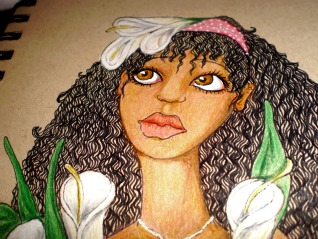
You will notice I made some close up shots of her face. This is a little larger then 5x8 tonal paper. I was just trying to see if I could make the detail as fine as I could for such a small work. It isn't an ACEO small still smaller then what I am use to.

The camisole with the pink check and white lace is cute with the blue jeans and polka dot head band.I was a little concerned that the red would clash with the pink but I think it works. I will have this piece on sale at the end of the month. I will link here when it become available.

Madeline

I don't really like doing practice sketches because it seems to be just a waste of paper. I recall when I took drawing classes in between my regular course work, I did so to break up the monotony but I really got to enjoy it. Anyway, as I was learning that it was necessary to warm up before starting a serious drawing, I had to purchase newsprint. It was a cheap paper just for those practice sketches ... I still had to go purchase it. There I was in class watching this one guy who was an architect major. He would no sooner start one sketch then rip it off the easel and throw it to the floor
to start another. I recall thinking, how wasteful? When I saw the teacher go behind the student to pick up the drawing to study and then grade on what was going to be thrown away, I had to get a grip.


Away from the class, I had to start remembering the better habits of the art class to do better work. Here are the sketches of Lilly, Daphne, and Poppy. As you see in the previous post of Daphne, I squeezed them together in my sketch book. I still can't imagine drawing just to throw it away. Madeline didn't make the sketch. She was one of those "happy accidents" Bob Ross use to talk about.


I put clothes on Madeline because I was noticing that how each one had their arms covering themselves or backs turned away. It wasn't intentional, but I was going with it. Madeline doesn't really have a story to tell other than it isn't too often that a girl or woman of color is illustrated in nature, with birds and flowers. I figured it was high time.

You will notice that she has a head covering. It wasn't supposed to be a bandanna but I didn't wish to draw all of the fabric on her head, or a bowl, or carrying laundry as I have seen done with African maidens. Why can't she just be a girl that likes birds, flowers, and the things of nature like fair complected females are depicted doing? I added a bird for interest and color contrast, which you will see for yourself.

The flowers I chose that went well with the color of her skin and outfit are Morning Glory. This particular blue went well with the Prisma-color Scarlet Lake and and the Grass Green background. I was pleased with the finished product which will be on sale at http://www.redbubble.com next week. I will link it here when it is available.

Sunday, April 28, 2013

Forlorn

I was in the middle of drawing the art nouveau women of color, when I was inspired to do this particular piece. I was using tonal paper on a small sketch book. Though the pictures make this image look bigger then it is, it is only 5x7.

For some reason, I started coloring the image before inking - again. I think I was just too excited to see if I could complete a full image of color. I hadn't done so in a little while. I also started the foundation of the skin in gold. All while I was putting in the color, I was second guessing myself if the finished product was going to look like a reject from the Simpsons. It was about then when I was doing the eyes, did I realize to establish where the light was coming from for the shadow to be placed around the strands of hair. It started to get tricky around the eyelids and I was about to start all over again if I hadn't stopped and stepped back to see what I had done thus far.

I think I used about 7 different colors to get the skin right. I never thought I would ever have to use olive to tone the skin down from being too gold or too orange. It was good to know. I had made a mistake thinking I could use gray or lavender as I would for Caucasian skin. For black tones it came out ashen.

Thinking I had finished the piece, again I stepped back only to see that the fingers as well as the strap of her garment needed some shading. I also saw where the whites of her eyes are too white. I saw an artist on you-tube practically colored the whites of her subject's eyes all a light gray and then came back to put "China White" only where the light was hitting. They looked very realistic. I'll have to do some more practicing.


  I will link the finished piece here when I figure how to shade the arm without it looking strange. I tried once already and looked like another strap. The sides of her fingers need more detail as well as the sides of her face and more shading in the eyes.  I might be over thinking it. I am already looking forward in doing the next one.

Saturday, April 27, 2013

Daphne

This is another at my attempt to not only trying to establish my niche but to also incorporate my favorite style (art nouveau) with women of color. I tried doing this some years ago and failed miserably. I will post one or two of those images later and link it here. These are rough sketches of the three women of color I plan to do in an art nouveau style. For this one, it is the middle image.


With this, like Poppy, I used tonal paper. It is easier to establish skin tone. Pastel paper is good for this as well. For some reason I thought I could get a better tone without looking ashy or muddy if I did my sketch in white color pencil and then fill in with marker rather then lining it with ink. I won't do that again.

I had already knew I was going to use the daffodil flower before I knew what Daphne was going to look like. It was the leaves that proved to be the challenge knowing that not only did it have to fill the page but look ornate as well.

When I scanned the finished piece, I noticed how the white shown through. I went over the line digitally just to cover the white and hoping not to have messed up with the integrity of the work.

Still working on the style, as you can see. I am also doing much research to stay inspired to finish the series. Thank you for all of the views. I would appreciate comments and critiques if you have any better ideas then what I am doing. Thank you again.

Thursday, April 18, 2013

Poppy

I had this idea to do a series of women in a precarious position that most of us would not find ourselves. Initially, it was supposed to be a face and some flowers - practicing my version of art nouveau. As I progressed, the piece developed a message. Continue reading, you'll see what I mean.

I did this one over a few times.


I sketched it on white drawing paper and then tried to make a decent likeness on tonal paper. I liked the shape but when using colored pencil and trying to get where I thought it should look like....ugh! It wasn't working. She was looking really ethnic...so I ditched it and started all over again.

As I continued drawing, it reminded me of a woman I spoke to for a little while. This relatively attractive professional woman had this relationship with a man and had him move in to her home with her children. He had shown signs of being a violent person but instead of telling him to get out, she decided to work with what she had. She never married this man but still decided to remain with him. She left her home when he broke her arm. The violence never really registered with her. Even when she saw the look on her children's face, it wasn't really and truly violent in her mind. When she found herself in a shelter to be protected from him, it wasn't quite what caused her to see what she had done. It took a few days later when she was nursing her arm and someone noticed how it flopped (her arm). She went to the hospital and had an x-ray done. She looked at the light box of her arm (in the x-ray film) and saw the clean break of the bone. She started to freak out. Reality finally set in.

After I drew this image, I saw how I posed the arms and tried to do the same pose myself. It wasn't comfortable and the curve of my arm couldn't lie flat as I drew this one here. I didn't change it because of what she reminded me of. Even the expression of having gone through so much and still deciding to go through it again. No matter what I said, the director of the shelter, other residents in the shelter, it was her decision. She had to desire to be safe, if not for her, then her children. She had to request getting the PPO, the safe plan, change the locks, and call the police if he ever returns. She had to learn to love herself and know that she was worthy of being loved not abused.

Yeah, I saw her later...about 2-3 months. She was sitting in a popular hamburger restaurant. When she saw me. I think I stopped a few feet from the door and stood still in shock. She left the man at the table to talk to me. She didn't think I recognized him. She tried to convince me that they were only talking, but I knew better. She still had the cast on her arm. He never raised his head to see where she was going and who she was talking to...he was concentrating on the most perfect words to feed her. We paused for a moment....I didn't have anything left to say and she had to get back to her....meal.

The whole image reminded me of her even down to the twist of her body. She knew what was right but she had to keep going back to him for whatever the reason. Holding her arm, it just wasn't real...for her yet. I added flowers for the background because the red seemed so prominent against her skin. Evident to everyone, still she looks at the viewer hearing the words but not listening.

Black women aren't depicted too often in the style of art nouveau. I found this out about 5 years ago and was sadden by the discovery. Whether the original artists thought that black women weren't commercial enough to use or attractive enough - it was their loss. Long flowing hair is indicative of the style. I choose to shave the head of this work and have a small blonde fro. I thought about the recent medical survey showing that African American women are more prone to heart disease and have the highest rate of being susceptible to HIV. If that study is true, I wondered if it has anything to do with so many single black women raising their children without the fathers. I wondered about how women give themselves so casually because they are starved for affection and the men know it. I wondered if a father was around to tell his daughters how beautiful they are would that woman, mentioned earlier, have such a difficult time in making a decision that would seem so obvious to everyone else.

Wednesday, April 10, 2013

Camouflage

I wasn't intentionally trying to draw a series with this but it was fun to do and when I finished one, I really wished to have had a small collection of them. Only, this one that I did seemed to have taken forever. Eaxch leaf had its own set of veins and then I added birds, and butterflies for interest. when I was finished with them, I barely could tell where each one was until I focused intently - hence the title of this post. This particular one is called, In the Thicket.


As you can see, the others will take some time. The hours for this one.... I have no idea. Once I got into it, time didn't matter.

A Niche Is Hard To Find

I returned back to drawing about 5 years ago after finishing college, raising a family and building on a human professional career for the last 17 plus years. I found there were techniques that I forgot about and some styles I never really studied before. When I happened upon Alphonse Mucha, I knew that was the style for me. The problem was art nouveau is so distinctive, it was going to be difficult to try to make it my own.
I did so much research online and in the library. What I found was that current artists, got what I was trying to do - develop my own style. How does one do that? I watched other artists for hours marveling at their techniques and picking up unforgiving mediums to use with such ease. I hated to admit how I envied them. Anyone that watched them long enough could tell their style from anyone else's.

For instance, Audrey Kawasaki, Bec Winnel, Moon Spiral, and Michael Shapcott are well known artists for their distinctive styles. If they never signed their work, it wouldn't matter - we would all know who the artist is. They found their niche. Their style is all their own. It is a feat that can come with practice and knowing who you are as an artist.

I have been trying to follow the trend in the page views of my work...however, people are fickle in what they like today as opposed to yesterday. Alice and Wonderland illustrations has had wide appeal for the last 4 years. I received many page views and features for my illustrations under that category:


As much as I liked drawing these pieces, I couldn't get the distinct style that I wished for... but it didn't keep me from still searching. These drawings do well being appealing. I like the details and the use of black ink on white paper. I also liked having just a bit of the image coming out of the box. It was my unspoken message of not conforming to someone else's rules all of the time. I like it, and it has become a part of my signature. So I found a little of my niche. Now, what else?