Tuesday, October 14, 2014

Inktober 2014

Inktober begun in 2009 for artists to come together and create an ink drawing for every day of the month of October. Well, I never heard of this before and accepted the challenge 3 days into the month. I had some catching up but saw it as something fun to do. When I saw that many of the works were sketches or free hand of form, I was going to do the same thing but just wasn't comfortable in having that online. Its like answering the door in a bathrobe and curlers. Why would you want anyone to see you like that?

The first drawing I submitted was the last entry for the Drop Cloth Series. It was fitting seeing where the other works were coming from, the expression for this last one was as if she was fed up with it all and was seeking help. But if her parents weren't going to give it, then who was she supposed to look up to?

The next 3 were a series of hairless cats. I saw these animals and was fascinated at how ugly they are
tot he point of having to draw them. This brought the challenge to the 5th day. Another series of 3 were frogs. These three are a little quirky and fun to draw. The stippling took some time and the idea of coloring these later is appealing.

I saw a picture of a stuffed toy and had to do my own version. After finishing it, I named it Bunny and was placed in the corner for punishment because of using art supplies when there was other school work to do. The next piece was of Bunny making the best of the situation. I thought it was funny and have no idea where the story came from - it seemed to be crying for it.

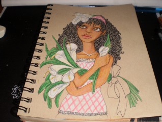
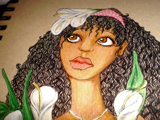
On the 10th day, there was an aquatic series of marine life. Trying the Japanese style worked for the first one and then, I don't know what happened. Still, its fun and am determined to get through the challenge. On the 13th, my intention was to do a series of owls. I needed to stretch my scope of subjects to draw. Usually its flowers and females and seeing I haven't drawn in a little while, this challenge was perfect to get ting me out of the slump. But it was right about here, where I was looking to get back to my flowers and
portrait illustrations. Still focused, I got through one of the owls.

To see the other entries to the Inktober 2014, click on the link or go to my art page on Facebook and click the thumbs up - please.

Monday, September 29, 2014

Finishing Drop Cloth

For little over a year I have been working the Drop Cloth series off and on. There were times as I finished one piece to the next I thought of the children I worked with over the years and how they fared with all of what life has to offer and how much each of them didn't know. I find it perplexing that when my mother was ill, I had the inspiration of doing this series. She passed on to be with the Lord the beginning of the year, and now after 16 pieces do I believe the series is finished. Its a peculiar number to finish with and the timing as well.

Nevertheless, when looking at the last piece still incomplete, one of the guests where I am employed was introduced to me. She saw my work and I explained what it meant. She had the same reaction as so many others in hearing the portrayal of the series. However, she was the only one that heard why the series is completed. She said,"that's why she looks like this." I thought she was referring to the piece being incomplete. She was referring to the expression of the girl. Deliberately when sketching each piece the children were made to be looking at the viewer so the each person looking back could see what is happening to our next generation. The way we treat material objects is with so concern more so then the very ones that will soon be heads of state and corporations. These children will be in the government making decisions that will be affecting our lives. How wonderful would that be if they learned something about compassion, considering the other person, or love? Instead what they have learned is that is is a dog-eat-dog world and you better get your before someone else snatches it fro you. How do I know? Because a teacher said it to me while I was 1 of 30 in grade school. Did  the system get better? Are there better teachers that inspire children to learn? Really? In Detroit, Michigan 60 schools were closed down, boarded up, and some were demolished. No one fought it. When adding more tax to cigarettes, there were those that had petitions, the senators got involved, and it became a ballot to vote on.

The last piece was of a girl with her hands of her face pulling downward. She is a young child dealing with adult problems and having nothing to draw from to resolve the giant of an issue. Who is she going to go to? Who has the answers? Mom and Dad are arguing. The teachers don't have the time. The counselors are focused and one thing and nothing more then that. Where is the help? Where are all of the resources to keep this child whole and healthy. So she looks up. Its what I have been taught as well in those times when there is no one left to hear the gripes and complaints and you realize as an adult, that complaining gets you no where. You look up. 

When that last piece is finished, I will link it here.

Friday, July 11, 2014

Greeting Cards

Its been a little while since I have posted anything. I had lost my inspiration due to a loss in my family and have been trying to get it back. During that time, I was doing a host of research and browsing through Michael's every now and again. As much as I am not a scrapbooker, I have become fascinated with greeting cards. Seeing that I do them anyway with my art work, I decided to see what else I could do with them directly.

Having a fascination with how big the scrapbooking phenomena has become, I went through all of those aisles that is specifically for them. The area I have a fondness for are the rubber stamps. Its been that way since I was a child and went through Frankenmuth, Michigan. I recall seeing the wealth of rubber stamps back then and just went, "aww, ooh." I don't know why but knew I would have liked to have at least one. I don't remember if I got it or not, just the feeling when I saw them.

I have a collection of stamps, punches, and various paper pads right now. I also have a collection of pictures from others who have been doing greeting cards for years and are artists in their own rights with the absolutely gorgeous things they have created.

For the last few months, I have been studying the rules when making cards. Some don't follow any thinking that whatever looks good to them should also look good to others. But that's true of any artist - isn't it? The thing is, I am  trying to sell my work. As much as I have researched with the color rules and doing your own thing, it hasn't come together. I have to like it, yet in that small space it can't be overwhelming to the viewer. Its such a fine line.

Here are my 2nd and 3rd card attempts. The 1st one is pinned on my cork board. I keep it there to remind me what not to do anymore - ever!
I stamped this card on multi-media paper and then colored it with the Tim Holtz distress markers. I was looking to make the coloring with some sort of depth. I stippled it at first and changed the colors to shade in the folded areas. It looked too flat to glue to a piece of cardstock so I tore the edges and distressed it a little  - lol. It still looked flat. And then I remembered the raised glue squares. It was too late for them, I had completed 4 cards in this same way. The only thing was missing was the sentiment, I figured I could get a little more creative with that but didn't know with what.

My second attempt was a little more fancier. I used a different stamp but water colored the back ground with a little pink and blue gray. It can't be seen really well in the picture but its there. I also tried to get fancy with the grass but didn't want as much color seeing this is supposed to be a masculine card which didn't keep me from dolling the card up with 3 tiny brads at the bottom of the piece. I used the embossing powders for the first time in the sentiment and found out why the heating tool is needed rather than my blow dryer.

Its my 3rd card and was more pleased with this one then the 2nd. I think I can do this for a little while and do well at it. I was hoping it not take as much time but these 4 cards took almost 2 hours to complete. Eh, I'm new, its won't be like that all of the time. You can see for yourself when I link this to a video.

Wednesday, August 7, 2013

The Makings of Drop Cloth

Before really deciding the career I was going to go into, I was a Youth Specialist caring for the needs or redirecting the behavior of at risk teenage girls (what some circles call, throw away kids). I watched these girls try to cope with learning things we have all taken for granted. They were more concerned with matters that only adults should be thinking about and their development in the matters of a child were arrested. What went tilt after these children were born?

While thinking this, I was in my studio about to embark on another series. I looked at what I had done and wondered if I was really pleased with my work. I know when I initially started back with art about 5 years ago, I was so in love with the style of art nouveau. In studying those artists, I saw they neglected using women of color. It was upsetting. So I began drawing those women in that particular genre. What happened was I started thinking like a business woman and saw what was getting more responses then other pieces. I began concentrating on generating more income and looking at those artists that were more successful then myself. From what I gathered, it was illustrators and caricaturists that were getting the interest that I desired as well. Slowly my work began border lining on illustration. There wasn't anything the matter with illustration art, I liked it...but it wasn't what I know.

Isn't that what is taught with writers? Aren't writers suppose to write what they know. The subject matter is more rich and interesting to the reader. How much different is that lesson from what an artist should do? Isn't that how an artist really finds his/her niche? I then researched how to find the niche of an artist, as you have read in my other entries on this blog. I noticed that other artists did have a particular style they never deviated from. My work has a style but there was something missing....something I forgot about....its the thing I know that I know. I didn't incorporate what I chose as I career.

I have watched people for years. I have studied behavior and have wondered why an adult would do this or that. In so doing, I discovered another aspect of my style of art work.

In this series, called Drop Cloth, I thought about the artists from the 60's and early 70's. I never understood the splashing of paint from one side of the canvas to the other and then for the viewer to understand the artist's message in the work. It looked like a drop cloth a painter used when protecting the furniture or the floor. Enter a child excited about something that happened in school or seeing a caterpillar for the first time. Will the painter, artist, or busy parent for that matter, stop what he/she is doing to listen to the child go on and on about something as mundane as a caterpillar? Who is more important? What about the estranged parent on the phone to a child saying derogatory things about the other parent and using the child as a pawn? What about the parents arguing in front of the children not caring what damage words have on delicate ears? Its like slinging paint and not caring where it lands.

In the series, the children's faces are drawn in my favorite medium, black ink. The canvas is white Bristol. Each piece is cut 6 x 4 1/4 inches. I used only 2 different colors in the water color wash. The two colors represent having two people that created a child and needing two people to raise a child. Whether the parent is estranged or not, he/she has something to do with the development of that child. The parent may never be mentioned, it doesn't mean the child doesn't think about him/her. The eyes of each drawing never see the color wash. The reason for that is the same as the faces looking at the viewer. The innocence children lose is not always from outside sources. Children are like sponges. They absorb what is in front of them. If they are not protected, they will repeat the behavior. There use to be a time when a child's ears were covered from the use of profanity...now children repeat those words. Where did they learn such behavior?

The rest of the series can be viewed on my facebook page, Lenora's Ink.

Monday, June 3, 2013

Just Because

I call this piece "Just Because". The title came from when a man who I am use to asking to see my drawings made a comment. First let me preface, I had been drawing Caucasian women for the most part. It seemed as long as I did, most of the community would come by and be pleased with what they saw. In using a tonal pad or the first time, I found that it was easy accomplishing other skin tones. The response I received wasn't favorable.

I suppose I would have normally gone back to what I have been doing. The only problem with that, I liked what I am doing now and didn't wish to go back. I continued then no matter what the response. Why? Well, just because. Whether anyone likes it or not - I like it. And frankly, its about time!

I have been drawing in hopes that I could generate sales. Whether I liked it or not. If the people like it, sales would be abundant - right? Not so....not like I would have liked.

The sketch wasn't difficult and it seemed like everything was balanced. For some reason, I stopped inking before going on with the color. When I realized it, I stopped to take another look. How did the eye get to look like its looking different from the first?
 I was a little discouraged thinking that it would work itself out as I went along. The thought of tossing this one was something to fight. The tilt of the face was causing the rest of the face to go tilt as well and the balance was getting a little off. It then became to be a challenge. As long as anxiety didn't take over, there had to be a resolve.

I took another step back and was pleased with the final outcome. Every time I draw a woman of color, I can either see myself, someone in my family, or someone I met in my life time. It just seems so cool to me. I am still liking this tonal paper. I am hoping I will find other uses for it.
The final product is posted on my new account on RB. Cards and prints are available for sale. If interested in the original, please email me.

Thursday, May 23, 2013

Lilly

Lilly is actually the first one drawn in the sketch seen on the Daphne post. It took a moment to draw her as well as it did Madeline because I wouldn't stop drawing them covering up their bodies. I have no idea why. So I put clothes on the last two...still they had to have flowers. It was something I added because it isn't shown with women of color too much.


I saw them all of the time when studying art nouveau with Alphonse Mucha most often...the flowers that is. Definitely not women of color, which I have written about before.

Instead of placing Lilly in a field and being a city girl myself, I really like the texture and design of brick. Don't ask why. I noticed that I have done this several times before in other works of mine. What she is looking at, and it didn't come out too well in the scanning process is a humming bird.

I was talking to a co-worker that deliberately plants certain flowers for the humming birds to come to his garden. In Michigan? I have never seen them. He says after awhile they have got friendly with him and will buzz right to his hand... or rather humm. That was a little hard to believe but apparently on my mind when drawing this one.


You will notice I made some close up shots of her face. This is a little larger then 5x8 tonal paper. I was just trying to see if I could make the detail as fine as I could for such a small work. It isn't an ACEO small still smaller then what I am use to.

The camisole with the pink check and white lace is cute with the blue jeans and polka dot head band.I was a little concerned that the red would clash with the pink but I think it works. I will have this piece on sale at the end of the month. I will link here when it become available.

Madeline

I don't really like doing practice sketches because it seems to be just a waste of paper. I recall when I took drawing classes in between my regular course work, I did so to break up the monotony but I really got to enjoy it. Anyway, as I was learning that it was necessary to warm up before starting a serious drawing, I had to purchase newsprint. It was a cheap paper just for those practice sketches ... I still had to go purchase it. There I was in class watching this one guy who was an architect major. He would no sooner start one sketch then rip it off the easel and throw it to the floor
to start another. I recall thinking, how wasteful? When I saw the teacher go behind the student to pick up the drawing to study and then grade on what was going to be thrown away, I had to get a grip.


Away from the class, I had to start remembering the better habits of the art class to do better work. Here are the sketches of Lilly, Daphne, and Poppy. As you see in the previous post of Daphne, I squeezed them together in my sketch book. I still can't imagine drawing just to throw it away. Madeline didn't make the sketch. She was one of those "happy accidents" Bob Ross use to talk about.


I put clothes on Madeline because I was noticing that how each one had their arms covering themselves or backs turned away. It wasn't intentional, but I was going with it. Madeline doesn't really have a story to tell other than it isn't too often that a girl or woman of color is illustrated in nature, with birds and flowers. I figured it was high time.

You will notice that she has a head covering. It wasn't supposed to be a bandanna but I didn't wish to draw all of the fabric on her head, or a bowl, or carrying laundry as I have seen done with African maidens. Why can't she just be a girl that likes birds, flowers, and the things of nature like fair complected females are depicted doing? I added a bird for interest and color contrast, which you will see for yourself.

The flowers I chose that went well with the color of her skin and outfit are Morning Glory. This particular blue went well with the Prisma-color Scarlet Lake and and the Grass Green background. I was pleased with the finished product which will be on sale at http://www.redbubble.com next week. I will link it here when it is available.