Showing posts with label flowers. Show all posts

Friday, July 11, 2014

Greeting Cards

Its been a little while since I have posted anything. I had lost my inspiration due to a loss in my family and have been trying to get it back. During that time, I was doing a host of research and browsing through Michael's every now and again. As much as I am not a scrapbooker, I have become fascinated with greeting cards. Seeing that I do them anyway with my art work, I decided to see what else I could do with them directly.

Having a fascination with how big the scrapbooking phenomena has become, I went through all of those aisles that is specifically for them. The area I have a fondness for are the rubber stamps. Its been that way since I was a child and went through Frankenmuth, Michigan. I recall seeing the wealth of rubber stamps back then and just went, "aww, ooh." I don't know why but knew I would have liked to have at least one. I don't remember if I got it or not, just the feeling when I saw them.

I have a collection of stamps, punches, and various paper pads right now. I also have a collection of pictures from others who have been doing greeting cards for years and are artists in their own rights with the absolutely gorgeous things they have created.

For the last few months, I have been studying the rules when making cards. Some don't follow any thinking that whatever looks good to them should also look good to others. But that's true of any artist - isn't it? The thing is, I am  trying to sell my work. As much as I have researched with the color rules and doing your own thing, it hasn't come together. I have to like it, yet in that small space it can't be overwhelming to the viewer. Its such a fine line.

Here are my 2nd and 3rd card attempts. The 1st one is pinned on my cork board. I keep it there to remind me what not to do anymore - ever!
I stamped this card on multi-media paper and then colored it with the Tim Holtz distress markers. I was looking to make the coloring with some sort of depth. I stippled it at first and changed the colors to shade in the folded areas. It looked too flat to glue to a piece of cardstock so I tore the edges and distressed it a little  - lol. It still looked flat. And then I remembered the raised glue squares. It was too late for them, I had completed 4 cards in this same way. The only thing was missing was the sentiment, I figured I could get a little more creative with that but didn't know with what.

My second attempt was a little more fancier. I used a different stamp but water colored the back ground with a little pink and blue gray. It can't be seen really well in the picture but its there. I also tried to get fancy with the grass but didn't want as much color seeing this is supposed to be a masculine card which didn't keep me from dolling the card up with 3 tiny brads at the bottom of the piece. I used the embossing powders for the first time in the sentiment and found out why the heating tool is needed rather than my blow dryer.

Its my 3rd card and was more pleased with this one then the 2nd. I think I can do this for a little while and do well at it. I was hoping it not take as much time but these 4 cards took almost 2 hours to complete. Eh, I'm new, its won't be like that all of the time. You can see for yourself when I link this to a video.

Thursday, May 23, 2013

Lilly

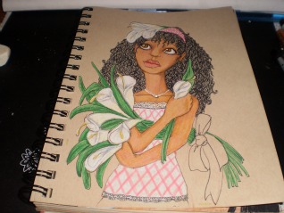
Lilly is actually the first one drawn in the sketch seen on the Daphne post. It took a moment to draw her as well as it did Madeline because I wouldn't stop drawing them covering up their bodies. I have no idea why. So I put clothes on the last two...still they had to have flowers. It was something I added because it isn't shown with women of color too much.


I saw them all of the time when studying art nouveau with Alphonse Mucha most often...the flowers that is. Definitely not women of color, which I have written about before.

Instead of placing Lilly in a field and being a city girl myself, I really like the texture and design of brick. Don't ask why. I noticed that I have done this several times before in other works of mine. What she is looking at, and it didn't come out too well in the scanning process is a humming bird.

I was talking to a co-worker that deliberately plants certain flowers for the humming birds to come to his garden. In Michigan? I have never seen them. He says after awhile they have got friendly with him and will buzz right to his hand... or rather humm. That was a little hard to believe but apparently on my mind when drawing this one.


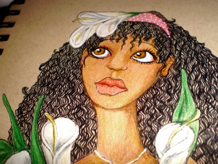
You will notice I made some close up shots of her face. This is a little larger then 5x8 tonal paper. I was just trying to see if I could make the detail as fine as I could for such a small work. It isn't an ACEO small still smaller then what I am use to.

The camisole with the pink check and white lace is cute with the blue jeans and polka dot head band.I was a little concerned that the red would clash with the pink but I think it works. I will have this piece on sale at the end of the month. I will link here when it become available.

Madeline

I don't really like doing practice sketches because it seems to be just a waste of paper. I recall when I took drawing classes in between my regular course work, I did so to break up the monotony but I really got to enjoy it. Anyway, as I was learning that it was necessary to warm up before starting a serious drawing, I had to purchase newsprint. It was a cheap paper just for those practice sketches ... I still had to go purchase it. There I was in class watching this one guy who was an architect major. He would no sooner start one sketch then rip it off the easel and throw it to the floor
to start another. I recall thinking, how wasteful? When I saw the teacher go behind the student to pick up the drawing to study and then grade on what was going to be thrown away, I had to get a grip.


Away from the class, I had to start remembering the better habits of the art class to do better work. Here are the sketches of Lilly, Daphne, and Poppy. As you see in the previous post of Daphne, I squeezed them together in my sketch book. I still can't imagine drawing just to throw it away. Madeline didn't make the sketch. She was one of those "happy accidents" Bob Ross use to talk about.


I put clothes on Madeline because I was noticing that how each one had their arms covering themselves or backs turned away. It wasn't intentional, but I was going with it. Madeline doesn't really have a story to tell other than it isn't too often that a girl or woman of color is illustrated in nature, with birds and flowers. I figured it was high time.

You will notice that she has a head covering. It wasn't supposed to be a bandanna but I didn't wish to draw all of the fabric on her head, or a bowl, or carrying laundry as I have seen done with African maidens. Why can't she just be a girl that likes birds, flowers, and the things of nature like fair complected females are depicted doing? I added a bird for interest and color contrast, which you will see for yourself.

The flowers I chose that went well with the color of her skin and outfit are Morning Glory. This particular blue went well with the Prisma-color Scarlet Lake and and the Grass Green background. I was pleased with the finished product which will be on sale at http://www.redbubble.com next week. I will link it here when it is available.

Saturday, April 27, 2013

Daphne

This is another at my attempt to not only trying to establish my niche but to also incorporate my favorite style (art nouveau) with women of color. I tried doing this some years ago and failed miserably. I will post one or two of those images later and link it here. These are rough sketches of the three women of color I plan to do in an art nouveau style. For this one, it is the middle image.


With this, like Poppy, I used tonal paper. It is easier to establish skin tone. Pastel paper is good for this as well. For some reason I thought I could get a better tone without looking ashy or muddy if I did my sketch in white color pencil and then fill in with marker rather then lining it with ink. I won't do that again.

I had already knew I was going to use the daffodil flower before I knew what Daphne was going to look like. It was the leaves that proved to be the challenge knowing that not only did it have to fill the page but look ornate as well.

When I scanned the finished piece, I noticed how the white shown through. I went over the line digitally just to cover the white and hoping not to have messed up with the integrity of the work.

Still working on the style, as you can see. I am also doing much research to stay inspired to finish the series. Thank you for all of the views. I would appreciate comments and critiques if you have any better ideas then what I am doing. Thank you again.

Wednesday, April 10, 2013

A Niche Is Hard To Find

I returned back to drawing about 5 years ago after finishing college, raising a family and building on a human professional career for the last 17 plus years. I found there were techniques that I forgot about and some styles I never really studied before. When I happened upon Alphonse Mucha, I knew that was the style for me. The problem was art nouveau is so distinctive, it was going to be difficult to try to make it my own.
I did so much research online and in the library. What I found was that current artists, got what I was trying to do - develop my own style. How does one do that? I watched other artists for hours marveling at their techniques and picking up unforgiving mediums to use with such ease. I hated to admit how I envied them. Anyone that watched them long enough could tell their style from anyone else's.

For instance, Audrey Kawasaki, Bec Winnel, Moon Spiral, and Michael Shapcott are well known artists for their distinctive styles. If they never signed their work, it wouldn't matter - we would all know who the artist is. They found their niche. Their style is all their own. It is a feat that can come with practice and knowing who you are as an artist.

I have been trying to follow the trend in the page views of my work...however, people are fickle in what they like today as opposed to yesterday. Alice and Wonderland illustrations has had wide appeal for the last 4 years. I received many page views and features for my illustrations under that category:


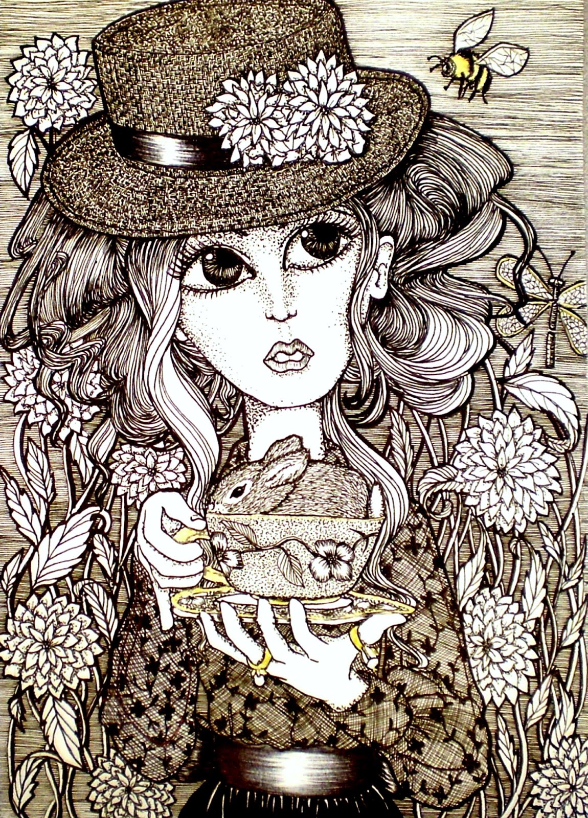
As much as I liked drawing these pieces, I couldn't get the distinct style that I wished for... but it didn't keep me from still searching. These drawings do well being appealing. I like the details and the use of black ink on white paper. I also liked having just a bit of the image coming out of the box. It was my unspoken message of not conforming to someone else's rules all of the time. I like it, and it has become a part of my signature. So I found a little of my niche. Now, what else?

Thursday, November 1, 2012

Blue and White Art Nouveau

It has become a separate category in my portfolio to continue with the blue and white drawings. for some reason, its more tranquil working with this one color then in my usual black and white. I am also receiving nice responses from the change.


I am particularly please with how these turned out. i hope this will be the beginning of other illustrations in full body with much more detail. I hope these are as appealing to you as they were exhilarating to create.

Sunday, July 15, 2012

Blue Willow

Jugend
I was going through some of the art websites in search of some of my favorite artists (little do they know) to see what makes them have more views and comments then others. I was noticing that each of them have a style all of their own. They rarely venture forth to do anything different from their established style. Even if one of them can draw realistic portraits in graphite, because the style established is marker, you will never see a graphite portrait. This sort of artist has been educated, studied, and knows what works well for him/her. I smiled at their efforts and how well they are all doing and then in focusing on my ability, I start to wonder and become frustrated.
Iowa Blue

Why be frustrated if I know I can draw well? Where does the frustration come from if I have studied too. Why would this be an issue?

Peacock Blue
Cerulean
Artists know that success in an endeavor such as art can be daunting. One cannot be sensitive to critiques nor weak when all don't crowd to purchase all of the finished products. It took me a bit of time to realize this. I recently had a critique from a piece that I was especially pleased with. I didn't ask for it, and he decided to write it as a comment on the art website. I was pleasant with the person because I have also come to realize artists might be sensitive, they (not including me) can be cut throat as well. The purpose for being cut throat is to remove the competition. It didn't work. I simply stated why I drew the piece as I did and thanked him for his unsolicited critique. Though that could cause some to fold and be done with it, I still went to search to see what I could do to make my art better and to develop my own style and stay with that.

Corn Silk
Brook
One of the things I have maintained is my enjoyment of Art Nouveau. I simply adore the style of Alphonse Mucha and Aubrey Beardsley. Mucha shows such brilliance when styling hairstyles and incorporates with flowers, foliage and branches. While Beardsley maintains a monotone with color if not all black and white, his crisp lines and attention to detail caused me to stare at each work longer then most. However, Art Nouveau didn't start with these 2 artists. I found before Mucha's time, Jugendstil was the name of the same style of art in Germany. The stylized flowers and foliage were much more extravagant and extended into architecture, jewelry design and furniture. That was it. There is no other style that has my attention more then this one. Now how can I make it my own so no matter who sees my work, can tell that it is mine without seeing my signature? It is such the compliment and the true acknowledgment of success when the style is well known.

Willow
Recently, I was studying the illustration of flowers to be inspired to develop a design for the background of portraits. As I went through the pages and pages on the search engines of the internet, I came upon the patterns of a very popular design in China. It is called Blue Willow, amongst others. It was not only the design that inspired me but the discipline of not showing color in flowers and maintaining just the same monotone of blue and white. I decided to make a go of it to see if it could work in portrait design.

Burleigh
The first drawing I called, Jugend. I did this particular piece last year and allowed for it to stand alone. I wasn't too sure I liked drawing a portrait in blue and the pattern looked a little too simple for my taste. So I stared at it from time to time and watched to see how well it would do with those that are following, watching, or am on their fav list. It was average, so I kept it but didn't think anymore about it. Inspired by the China pattern, I went for the other portraits and continued to draw until I completed them all. The second one is entitled, Iowa Blue. I didn't use a photograph for the portrait, I just needed to see another drawing with the flower design. I liked this one but it reminded me of the color pencil drawing I have called Clematis. Still, when finished, it still looked as if it needed something that I didn't do to the fist one. I don't know what the technique is called other then feathering the outline all the way around the image. I was beginning to like it and was ready to see the others.  
Celeste


Out of Denim
Peacock Blue, Corn Silk and Out of Denim came really quick. I was a little concerned that the details weren't as keen as the other two and I would no longer be inspired to do more. But it just didn't happen. After those three came three more, Cerulean, Violet, and BrookIn completing these illustrations I was beginning to see why I enjoyed doing portraits and that of women. There is a softness of femininity that is captured with the style of art nouveau. In this style many of the women from the past seemed stoic even slightly depressed or annoyed; yet, they all modeled for Mucha. His reasoning for making them appear this way was his style - it didn't necessarily have to be mine.


Prussian
Violet
I did think about the expression and about women of these days and times. There has to be a determination, a look of thoughtfulness, a little playfulness, but most of all feminine. Before I knew it I completed 13 of these blue and white pieces. So far on 2 art websites, they are doing well. Most have been featured on the front page of groups and I have received glowing comments. Have I found the style that I will use forever, I don't know. I still enjoy children's illustration and I don't see the style of Art Nouveau in that.  


Thursday, July 5, 2012

Experimenting with Different Styles

Every once in awhile, I look at the work I have done in the last 4 years and wonder if I have developed the style of drawing that it would seem everyone else has. What is a style in art work anyway? I always thought if you stick with a certain theme of drawing fans would know your work among hundreds of other pieces. So when I was looking at other artists, I saw them drawing the same character over and over again only in different settings and different clothes. Is that their style or have they hit a wall? Nevertheless, they are producing sales.Is that what art work is supposed to be about? i thought artist were supposed to be creative and drew what they are feeling or what they have seen. The expression is supposed to be revealed on canvas or is that what art use to be?

I have studied scores of research for different drawing techniques and what others are doing in their artistic endeavors. I was so fascinated with Manga style for awhile, I studied video tutorials, check out books from the library and even bought a few. It wasn't that I liked the original style of Manga but what other artists were doing with it. Personally the eyes are too big and glassy looking for me to incorporate into my work. I do like the shine that is used in the hair and the details in the folds and ruffles of the clothes. When I finally realized that Manga uses the fashion style of Lolita (both of which are Japanese), I had to also try my hand in my version of it.

I liked that they were only in black ink. It allows for the viewer to see more of the detail in the work. The pieces receive many views online and quite a few comments but the sales for these particular pieces aren't what I would like for them to be. Not only that, these four works took me so long to do, just to be compensated for the time in doing them, the cost for the originals would be high. No matter, I wasn't really looking to sell the originals anyway. My first attempt with Manga is the one with the fish and the bridge. It was also my first attempt with those kinds of curls, ruffles and the Lolita fashion. I was so pleased with that piece and at the same time relieved when I was finished with it.


This one at the dress shop, took the same amount of time to complete as the one above; nevertheless, I saw it on the white page before I drew it. This one also receive many comments and has been featured in a few art groups. The title of this is Decisions, Decisions. The title of the one at the top is Detention, then there is Pretty in Plaid and Sweet Lolita (fashion). I used line drawing for the shoes in Decisions, Decisions because I didn't wish to have most of the attention there, though I did not do the same when drawing the hats. Every once in awhile I stare at that and wonder if I should go back and redo the shoes. I suppose if it bothers me too much, I will. I have done it before with other pieces.


I was still fascinated with the Manga style and with my version of it. So I decided to incorporate it with Mehndi design just to see what would happen and add a little color in to boot. At first, I was a little apprehensive seeing that both design and style were strong enough by themselves so I did a little at a time to see if it would work and then took it to a level that surprised me.  When I drew this first one, I liked the affect of her being at the window. To incorporate the mehndi design, I used it in the curtains. The movement seemed to come along with creative process of the piece. I was also experimenting with the shine of the hair. This was not my best attempts with the shine and I knew I would have to do more studying on the matter. This one is called, There's A Chill.


I got a little more bold with the color and design in trying to complete a portion of the room but keeping the focus on the main characters. The colors were deliberate to catch the viewers attention and causes for the eye to move around the completed piece. If the design in the drapes didn't draw the eye down to the slight changed hue of the wall then the braids connect with the bear and the color of the window sill does it. This was also featured a number of times in art groups. It is entitled BFFs.

 The apprehension to venture out with this design subsided after BFFs. I was satisfied that I could incorporate the two styles and it would work. Once I completed Ruby, Tanzanite was easy. The others came one after the other and the time wasn't nearly as long as it was when I was just using black ink. 


I got the idea of calling these pieces the names of precious stones remembering a job I use to have in caring for at risk teen girls. The term used for them in the area that I was employed was, throw away kids. I was shocked at this term by colleagues that devoted their lives to empower children. I knew these children were eventually going to grow up and be the product of the person or thing that greatly influenced their lives. Believe it or not, these were going to be the ones that would make the decisions for the state of the world. These very ones should be considered diamonds in the rough. Only and expert would know what to do with such a stone. There is potential just waiting to be directed. With that in mind, I began a series of works and entitled the series, Precious Stones.

 Amber is wearing a dress I use to have when I was 6 years old. I drew her hair because it seemed like an American thing to do with that sort of dress. I was getting use to bringing the shine in the right direction as long as the gleam in the eye was there as well. I didn't know what to do with her as far as action was concerned so I referred to another piece I completed. It was the wrong way to go. As pleased as I am with the color of the background, her hair and dress, I think it was the catching of the butterflies that didn't appeal to the viewers.
 Amethyst came after I thought about a certain bride at her wedding. I was noticing all of the details she incorporated. From a small orchestra to the harpist playing a solo. I never looked at one playing a harp as much as I did this woman. Though I drew the figure with her legs crossed, a true harpist knows it would be impossible playing the instrument proficiently this way...but it looks nice. the shine and the curls were coming easier in this piece. The colors, I wouldn't normally put together, but when I did the name of the work was fitting.

By this time, I was in a stride to complete 12 pieces for a calendar. Garnet came when inspired by a photograph of a girl in gothic attire. I liked that she had so much hair and the doll was my own addition for dimension. While in the middle of completing the work, I noticed that I covered the arm that was supposed to be holding the doll. Though I could have scraped the whole thing or make the adjustment digitally, I liked the hair too much  to mess with it. Garnet received more views initially then all of them put together.
 I had the dickens of a time with this one. You see when uploading art work something happens in the transition. the colors start to look dull or over exposed. So I take the work to an online photoshop just to enhance the color for a better product. Sometimes getting the border straight is a part of that process. I usually do that in the paint application that comes on everybody's hard drive. It was the weirdest thing, once I finished all of the details, I noticed this black line that ran right through the entire piece. I didn't know how to get rid of it but to erase little by little not to destroy all of the work I just completed or start all over again. It took days before I just scraped it and started all over again. I needed for the work to look traditional and not digital. I was so pleased with this one in particular because of the shine in the hair along with the span of room the fly had to move in. I don't know if it was the position of her arm in shooing the fly away or keeping it modest with her pulling her shirt down, but the views or comments weren't as readily as I hoped. This one is called Chalcedony.

 Lapis was also a fav because she represented late Spring. I liked her foot up on the border and the blowing of the dandelion seeds. But like Chalcedony, she didn't do very well with views, comments, or features. I don't know why with as much studying as I did and looking at all of the works together, I was at a quandary. I thought it might be the hair but Amethyst was doing quite well. Then I thought it was the hat or the clothes, but Garnet was doing well also. I then thought that it was the site I was using and the viewers were just being temperamental, but these works are on 4 different art sites. After this series, I stopped trying to figure it out so I could get this niche once and for all and stop with all of the experimenting to find something that will work and be profitable for me. I started thinking of colors that appeal to people. Purple is a definite yes. When launching out to do Purple Topaz, I thought of Snow White and also children going back to school. This one took a few tries to complete. When finished, the views were satisfactory. The sales weren't.

When developing Walking Through Sunshine, I was feeling so happy and with how I imagined the way she would look. I liked the idea of the jeans and tied oxford shirt. It is what I would have liked to wear (though my parents would definitely had an issue with the shirt being tied to show my stomach) and have worn. It seems classic with a touch of youth in the country. I liked the design of the wheat and knew that I was venturing a little away from the original mehndi design, but still was pleased with the finished product. It took a couple of months before I relinguished in trying to get an assessment of what the public liked. This didn't come close. That was it for me. I liked it and that was all that mattered. I was finished trying to please the palette of people that will change at any given moment. I grew weary at trying to figure it out.


One of the last from the series to form the calendar is Peridot. I thought of the Michigan winters when I was a teen and standing for the bus to go to school. The winters in Michigan didn't care about the changes the of the calendar. When we hoped that March would bring a hint of gleam of the sun, the wind blew to let us know winter wasn't finished yet. it is why the flowers, butterflies and and all of the expectation of Spring was drawn in black ink. The colors were underneath waiting for the warmth to come. This did well in views and comments but by this time, I just didn't care anymore. I liked the style I developed incorporating the two and I am sticking with it no matter what the public seemingly likes today and gone tomorrow.